Blue wordmark
For light or warm-cream backgrounds.
The Trench identity
The building blocks of the Trench brand. Download the official logos and use this guide to keep every touchpoint unmistakably Trench.
Download brand kitOfficial assets · For press, partners, and community
01 / The mark
Choose the approved lockup with the strongest contrast. Keep the artwork intact and give it room to breathe.
 BLUE ON LIGHT
For light or warm-cream backgrounds.
For Trench Blue or dark backgrounds.
For white or light backgrounds.



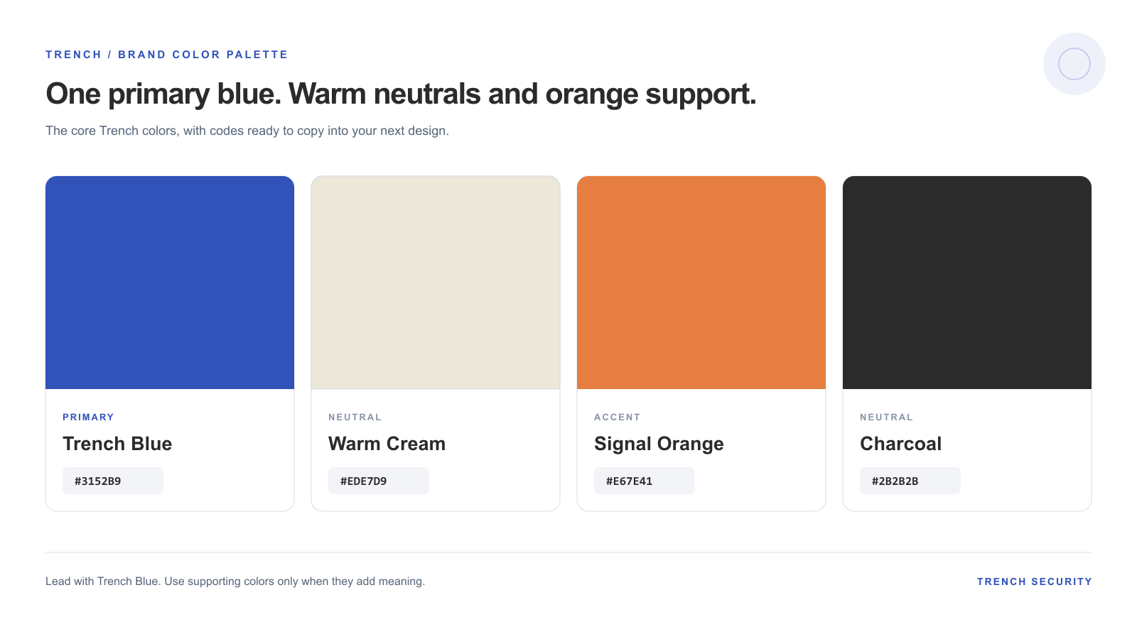
02 / Color system
Trench Blue is the anchor across products and communications. Use the supporting colors with intention, not in equal measure.
Select any hex value to copy it.
Keep text readable against every surface. Use Trench Blue for large fields and accents; use charcoal or white for body text where contrast matters.
03 / Logo usage
A consistent logo builds recognition. Follow these simple rules wherever the Trench name appears.
Minimum clear space
Keep at least one icon-height of clear space on every side. More space is always welcome.
04 / Typography
A two-font system gives Trench its recognizable voice: expressive in headlines, effortless to read everywhere else.
Built for the signal.
Use for page titles, key messages, and short, high-impact statements.
Clarity for every layer of security.
Use for paragraphs, interface labels, supporting copy, and longer reading.